
Kieran Goodson prepared an extensive breakdown of his most recent 3D environment Those Who Mourn: storytelling and symbols, environment design and production, learning sources, and more.
Introduction
Everyone knows the overwhelming feeling of losing something in our lives. It could be the disappointment faced after failing to hit a target you’ve worked towards. It could be the feeling of missing out on an opportunity of a lifetime, through no fault of your own. It could be the agonizing pain of a friend or relative passing away.
In one way or another, it seems we’re all familiar with grief. I believe that no matter how bad things appear to get, there’s an equivalent potential of good that balances the bad out.
In our world of games, this balance might be the reward of an epic mountainside vista just around the corner from an unbeatable boss battle or the hope of finding diamonds if you keep mining a little longer.
It’s the up and down nature that keeps these experiences both motivating and meaningful. Today, I’m going to discuss how I explored these themes in ‘Those Who Mourn’, my latest environment.
About the Artist
My name is Kieran Goodson and I’m a graduate environment artist from Cambridge, UK. In November 2018, I graduated from Coventry University with first class honors in BSc Games Technology. The course was foundational and introduced me to a variety of game dev roles. I fell in love with the 3D art modules and I’ve never looked back.
Since then, I’ve been honing my skills through personal projects. I’ve had fun developing my portfolio and will continue to adapt and grow it throughout my career. I’m searching for a junior environment art role to help create awesome game experiences with an industry team. I’m enjoying making friends from the community and it’ll be great to finally put faces to online handles and work with you all.
I like reading articles where developers share the decision-making processes behind their craft. I’ve structured this article similarly, with plenty of GIFs and images to cover the three main parts: the story, the design, and the technical breakdowns.
I hope you’ll find this interview surprisingly lighthearted considering the themes but also valuable so you can apply these methods to your art if you find them useful. Let’s begin!
Story Breakdown
Translating feelings into frames
The original purpose of ‘Those Who Mourn’ was to create a unique and aesthetically striking environment. The simple goal of wanting to recreate a weird forest soon turned into developing a weird forest that embodied something much more personal and meaningful. ‘Those Who Mourn’ explores heavy feelings of desperation, juxtaposed with the hints of hope and assurance that often accompanies our experiences in life.
The inspiration came from a mysterious Polish forest where the Pine trees bend and twist in various ways. I find the best kind of inspiration comes when you aren’t looking for it and I’ve had this image in an ‘inspirations’ folder for a long time. I liked the aesthetic and it was time to recreate it – with a twist.
@Archillect on twitter is a personal favorite and I often collect environments, cinematography, color combos, designs, lighting scenarios and traditional art from there. Any idea or theme I see that captures me in some way gets saved.
The first thing I do when creating a scene is looking for a piece of music that may fit the theme I’m trying to express, even if I don’t intend on making a video. I know I’ve found the right score when I can mentally visualize the cinematography along with the music. It’s my method of dreaming up keyframes that I can quickly sketch out and it allows me to confirm the direction and tone of the artwork.
I explored horror and post-apocalyptic themes based on the Crooked Forest and collected visual reference from ‘The Blair Witch Project’ and ‘The Book of Eli’. However, upon hearing a slowed version of ‘Ave Maria’ by Libera, I felt a biblical twist gave me the most profound feeling. I’m not a religious person, but I am fascinated with the symbolism and mystery surrounding ancient religion and their many archetypal stories.
Selling the semantics
I researched like mad. I spent three days defining the look and style of the environment using the ‘Tim Simpson’ method. This involves splitting reference into key images, lighting and AAA benchmark. It’s easy to see what you’re going to make and it’s motivating comparing the quality of your work to AAA games (within reason obviously).
I did research covering Christian symbolism, the Crucifixion and Entombment accounts in the New Testament and real locations of biblical relics and events. It was also a brilliant excuse to watch The Da Vinci Code series of films too. Nevertheless, I learned something crucial at this point.
There’s nothing worse than being patronized
I didn’t want the environment to be semantically blunt in the way it approached the themes. I didn’t want it to scream ‘this is about religion’ or ‘be sad, someone died’. It could certainly include those ideas but that doesn’t mean it had to look like them.
I deliberately avoided putting the Christian cross in the scene because it’s a cultural affordance that people recognize instantly. I wanted the ‘Those Who Mourn’ to take on the character by breadcrumbing mystery and symbolism throughout to clue players into the story. I wanted it to be grounded fantasy. Art director Grant Major describes grounded fantasy really nicely. He says:
“Viewers have never been to the place before, but nobody has been surprised with what they see because they imagine that it really could exist. It works because nobody’s shocked with its existence.”
I needed a realistic portrayal of an ancient forest with a believable, but an alternative, biblical narrative. Here’s how I tried to build that.
Leaving questions unanswered
The imagery of the Pine trees bending towards this secluded forest path suggests that something about the area is special. It could be cursed, enchanted, even magical. It’s certainly unusual. The player isn’t explicitly told but these are just some ideas that might spring to mind.
An angel can be seen collapsed onto her knees over a pine tree, devastated and mourning. We quickly get the impression that this might be a holy place because that’s where our prior knowledge of angels comes from religious texts. Her size creates a visually heavy and looming presence over the forest, emphasizing her importance. To the player, the mystery lies within her direct relationship with the trees.
Why are the trees bending? Is she having that effect on the plants? Who is she? Why that pose? What happened?
Her physical contact with the foliage suggests that the natural environment could be just as important to the story as she is. It’s almost as if the angel was real and turned into stone in this position or something.
As first impressions go, there seem to be more questions raised than answers given and that evokes a wild curiosity about the story, pushing the player to look onwards to find out what’s going on.
Some observant players may have spotted there are twelve crooked trees at the top, bending towards a tomb. This is a deliberate personification of the twelve disciples as if they were kneeling at the grave of Jesus Christ. One of the twelve catches our attention because it’s the one the angel leans over. It warps ferociously away from the tomb, unlike the rest. This tree symbolizes the one disciple that strayed from the path, betraying Christ and leading him to his death – Judas.
The subtle clues are by no means apparent, especially if you don’t know about these things. And that is kind of the point. Those who don’t know are left to wonder and take it all in, perhaps inventing their own versions of the story. Those who clock onto the references are left feeling smarter as their reading of the environment point towards what happened here, and who established this place of rest.
Using symbolism
Another crooked tree is creating an archway just beyond the path. It acts as a frame to another part of the forest and in the negative space of the fog appears a silhouetted animal. It’s a physical sign of life within the forest but also symbolic of the Holy Spirit, the third part of the Christian Holy Trinity. Although traditionally portrayed as a dove, a burning bush or wind, from one environment artist to another – the concept of the Holy Spirit is tough to make!
I felt the stag was an appropriate replacement as in many cultures, it is associated with spiritual authority, purity and luck. And also Jägermeister. But come on, this is serious – Jesus preferred wine.
The horseshoe shape is believed to connote luck too if the ends are pointing upwards. Not this time. The fallen tree creates a symbolic conflict as it frames the lucky animal. It adds to the overarching theme in ‘Those Who Mourn’ which is this unsettling co-existence of both hope and despair. Not one without the other. It’s encouraging the player to get a closer look while giving all the signs that the peaceful moment won’t last. The lighting also contrasts in a warm vs cool sense – more on lighting later.
One reference to rule them all
The rock engraving in the foreground reads IESVS-NAZARENVS-REX-IVDAEORVS or INRI- Latin for Jesus of Nazareth, King of the Jews.
It’s a direct reference to the insulting title given to Jesus by his persecutor, Pontius Pilate during the crucifixion. The title mocked Jesus and his followers as their ‘king’ was about to be executed. It was a warning of what would happen to people that led a following as it implied rebellion against the Roman Empire.
To Environment Artists, the INRI rock is an example of signage. In urban environments, examples of signage could be things like road signs, maps on the wall or labels on props with directions for use. Signage adds realism to environments because it grounds the player in familiarity. We see signs all day, every day. Signs tell us what to expect, what things are and sometimes they quite literally point us in the right direction.
In this example, the Latin writing gives the player a sense of real-world location and if you know of the acronym, you’ve got a good idea of who’s in that tomb and why this secluded forest is the way it is.
The tomb itself rests on a hill, raised high above everything else in the scene. The impression that this is a resting place of someone important is evident in the reading of its pyramidal composition. Triangular shapes can signify power and in the Christianity, the upwards pointing triangle denotes masculinity and the Holy Trinity. Light rays fall directly upon the tomb insinuating a connection with the heavens above.
Even the title of the environment comes from an event known as ‘the Sermon on the Mount’. Everything should encourage the player to explore the verticality of the environment. The quote is direct in its message and hopefully, everything I’ve designed in the environment supports the core theme of reassurance in an overwhelming sea of uncertainty.
“Blessed are those who mourn, for they shall be comforted” – Matthew 5:4
Environment Design Breakdown
‘Those Who Mourn’ level design breaks down into three art fundamentals.
- Shape Language
- Value Hierarchy
- Composition and Focal Points
I learned an incredible amount in these areas and feel my artwork has reached new heights after discovering them.
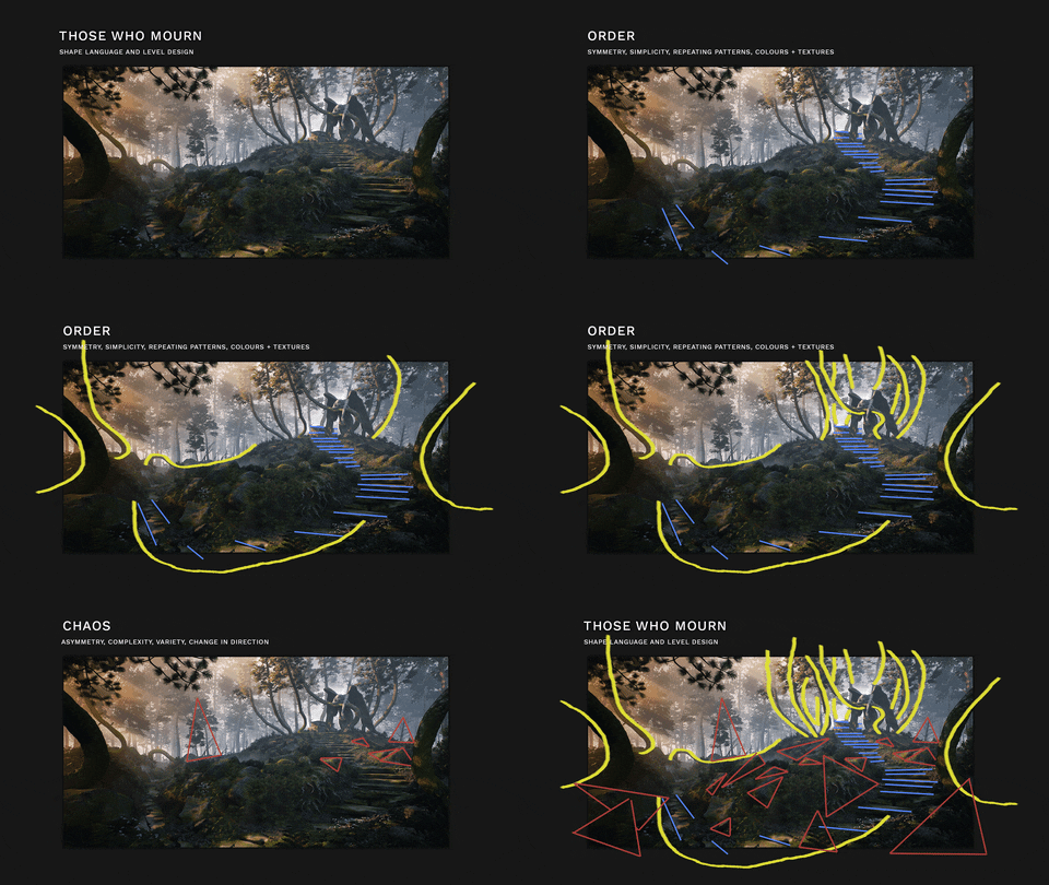
Are you fluent in shapes?
Fundamentally basic but subconsciously powerful.
- Triangles and other sharp, pointed shapes insinuate danger, unpredictability, and dynamism.
- Squares promote reliability, strength, static structure.
- Circles or curves can be used to visually describe innocence, peace, and fun.
These principles have been used in art and animation for years. Here’s how they break down in ‘Those Who Mourn’ and what they can subliminally communicate to the player.
Value Hierarchy
Essentially, we’re talking light and shadow. Blocking it out properly is essential in the ‘reading’ of the environment. I was constantly taking screenshots and using a neat Photoshop trick I learned from Clint Cearley to simplify the shots down to the most basic values and forms. It was easier then to evaluate which parts of the environment needed more light or more contrast or less noise to the overall image more satisfying (and therefore more readable).
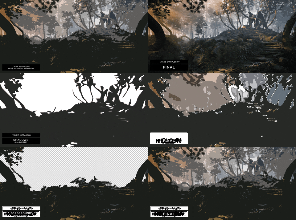
I was able to define a clearer value composition with this method:
- Shadows in the foreground to frame the area
- Midtones in the middle ground to give depth and balance the lightest and darkest parts
- Highlights in the background to represent the sky and atmospheric effects
Please bear in mind these aren’t hard rules. Like anything, use whatever will make your image better and don’t be afraid to play with these ideas.
Getting to the (focal) point
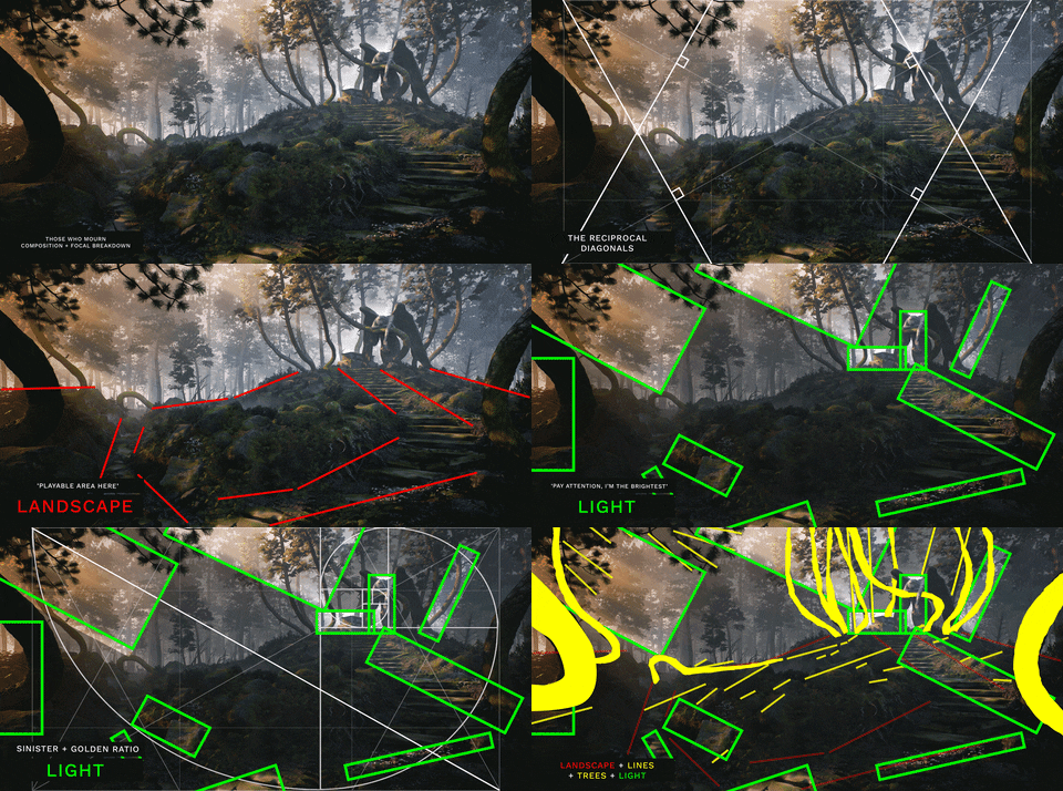
Establishing the main focal point was an interesting battle due to the wacky shapes of the crooked forest. It was important to establish order within all the chaos. I used six techniques to do this.
- The Unusual
Difference draws attention. A focal point can be created with something unusual as it contrasts with everything else that appears to be the same. Creating an entire crooked forest? Pfft. That went out the window here. I decided that the trees would have more of a visual and thematic weight if there weren’t so many of them. They’re weird so I wanted to use them effectively. A crooked tree in a crooked forest is normal but a crooked tree in a normal forest is something to behold.
I used the golden ratio to define the path and placed my trees along the curve. This wasn’t done just for the sake of using the ratio. Rather this was to match the curve of the trees to capture and then guide player attention through the frame via my three focal points. Angel, engraving, stag. Or vice versa. It provided me with a smooth leading line that I could use to visually compliment these weird and wonderful trees. Curves galore.
- Isolation
Isolate your subject! Photography 101. A clear focal point is established when something is on its own. The tomb and angel are the highest things in the frame, away from the other trees and it’s absolutely massive. There’s a reason why you wouldn’t ask for directions in Rio De Janeiro for the statue…
- Convergence
A more subtle method of using implied lines to direct the eye to something. Principles of dynamic symmetry and leading lines informed everything from landscape shape, the angle of the light, the height of trees, the angle of rocks and the distribution of flowers to support the main focal point.
- Color Contrast
I wanted the scene to take place during sunrise so I knew the warmer hues would come into play here. Everything I want the player to pay attention to is kissed with a yellowish-orange hue of the morning sun. This is contrasted with the background and shadows of the forest which carry the cooler blues you would expect at golden hour.
Color contrast is great but due to the time of day, the contrast in light and dark was more important. I wanted the path, the angel and the tomb to be most noticeable and the easiest way to do that was to give it some light.
- Value Contrast
I spent a lot of time in Photoshop during the project posterizing the image down to its most basic shapes and values. Shapes and forms are only as clear as the light allows them to be- tricky business as sunrises don’t cast harsh shadows and light is at its least bright. In order for the scene to feel organically lit, I played with this extensively until I felt the focal points were highlighted naturally enough with sunlight and fog for it to feel realistic.
Working in black and white takes away the distraction of color. I believe that the light and dark structures 90% of the art, providing it with direction and form. I think of color as the icing on the cake, bringing the scene to life with additional meaning.
Without the structure, the meaning is lost. Without the meaning, the structure is merely a direction with no message. Both light and color work together to communicate the message in an understandable way.
- Shape Contrast
The contrast in shape between the curvy path and crooked trees with the vertical Pine in the background means that there’s more focus in the foreground and midground where everything is happening. You probably didn’t miss the deer in the background because of this.
Remember, light and dark contrast may not always be the best method for creating a strong focal. That depends heavily on your environment and what the player objective is. So give these other methods of contrast a go:
- Isolation
- Color contrast
- Value contrast
- High activity vs low activity
- Textured vs non-textured
- Hard vs soft
- Difference in direction
- Difference in detail
- Straight lines, C curves and S curves
Technical Breakdown
Landscape
I created this with the Unreal Engine landscape sculpting tools and as you can see from the progress GIF below, this took some time to get right. It was only after several rounds of feedback that I really nailed down a dynamic composition. I wanted the angel and tomb to stand out so I carved a path out for the player to follow and the scene took off from there.
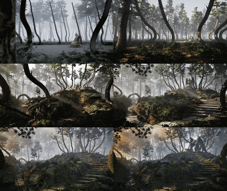
Halfway through the project, I realized my plants were placed completely randomly and was making the midground look scrappy. Danny Weinbaum (Indie Dev behind the newly released EastShade) wrote a great article on building realistic forests which helped me figure out how to structure the foliage and ground assets.
I came up with a simple subterranean structure too. Imagine this as a gradient from the largest, most dominant plants and objects in the forest right down to the smallest things. This really helped to establish some natural order within the foliage.
Crooked Trees
I blocked out the crooked trees straight away as I needed to see what kind of shapes I was going to be working with. To begin with, I created one basic tree trunk in 3ds Max when setting up the scene and only came back to it once I’d established a good composition.
When it was time, I added SpeedTree to my repertoire. A big reason why I chose to create the crooked forest was that I’d seen this software solution used to create some amazing foliage. This project was my first go at creating trees and root structures. I used the hand-drawing tool to create unique trunks and made node adjustments where needed. Branches, caps, and roots were generated after as normal- no magic here. I used the default conifer mesh shape for the branches and generated these accordingly.
I created four variants of the crooked tree, each with a distinctive trunk based on the reference shots. I’d like to spend more time learning SpeedTree as I feel I’ve not mastered it yet. The trees have issues with the leaf placement as well as shading issues which I managed to fix.
With some guidance from the awesome Dinusty discord community, I was pointed towards a tutorial that sorted out this shading issue by playing with the emission material properties. Below is the before and after trees and my UE4 material node graph that solved this problem.
I came to enjoy the look of the trees before I applied the fix as they seemed livelier. With the shader fix, it looked like the trees were shedding a bit which contradicts the idea of hope and new life growing back into the clearing. I didn’t have the time to alter the trees in SpeedTree so I compromised. I only fixed the Judas tree and the tree directly behind the angel to increase the contrast between her and the background. Although not the most realistic, I was willing to stylise for the overall context and composition.
A step-by-step process… to steps
My introduction to ZBrush came with the creation of the stairs, tomb, and angel. It took a while to get used to the workflow but I’m happy I was ambitious with it. Using the stone steps as an example, this was my process.
- Box model the base mesh in 3ds Max using simple primitives
- Import into ZBrush for sculpting
- Subdivide and use the Standard, Dam Standard and Clay Buildup brushes to create three eroded variations ( I found Andrew Averkin’s Environment brush pack very useful for adding extra crack detail)
- Decimate down to 0.3% of the model’s polys to retain a generous polycount and decent bake detail.
- Polycounts could be altered if needed but this wasn’t an issue in Unreal
- Import into Substance Painter for baking, texturing
- Import into the engine for a final pass, adding moss via vertex painting
The Angel of Grief
The angel was the most ambitious part of the project as I was new to sculpting and had little character modeling knowledge. I decided to split the task into smaller challenges. By modularising the task, I was able to see that it wouldn’t be as daunting as first imagined. The answer came using a combination of ZBrush and Marvelous Designer.
(A total of 3 new pieces of software learned and used for ‘Those Who Mourn’).
- The signature pose
Mannequins in ZBrush. To create the Angel of Grief, I used the female mannequin found in the shelf and adjusted the main ZSpheres to create my pose. Then I remeshed the mannequin to create a ‘skin’ that I could begin to sculpt. Adjusting the ‘ProjectionShell’ slider allowed me to retain the details of the pose onto the skin.
- Making marvelous robes
Marvelous was intuitive to grasp so it took no time to draw out the robe pattern. I imported my angel pose and played around with the folds, elasticity, and material to get the main creases looking nice. I was getting consistent artifacts, performance issues and stretching throughout so I ‘ve compiled a list of fixes that I found to be useful.
- Use the strainmap view to see where stretching issues and material tears are likely to occur (alt+7)
- Check your avatar/model scale – tiny avatars mean you’ll end up modeling tiny clothes and they don’t simulate accurately
- Twitching cloth? Head to the avatars property editor and reduce the ‘Skin Offset’
- Decrease the ‘Particle Distance (mm)’ of the fabric at the end of the modeling phase for a more dense mesh. I found it reduces the program speed and simulation performance so leave it until the end if possible
- For better performance, alter the ‘Iteration Count’ and ‘Number of CPU’s in Use’. I found my i5 Quad Core worked better on 2 but this depends entirely on your system. Try other things first and check the Marvelous docs for more info.(Object Browser > Scene > 3D Simulation > Simulation Property).
I encountered all of these, with the main issue being my angel’s scale after coming out of ZBrush. I hope you avoid the same problems. Paying attention to unit sizes in your sculpting and modeling packages is worth the double check.
- Sculpting like Michelangelo
Time to sculpt this angel. I collected anatomy references and went for it. The robes would actually be taking up a large proportion of the angel, exposing only the head and arms so I saved time by not sculpting unseen detail. Escaping the blocky mannequin pose and selling the basic body shape was half the job.
I used the same three brushes (Standard, Dam Standard, and Clay Buildup) and was able to create something that looks human- an achievement I’m proud of considering I nearly gave up several times throughout the project.
- Red Bull doesn’t give you wings
What did give me wings was blocking out in Max with reference and diligently managing vertices. I had to thicken the final shape with a shell modifier as the mesh was too thin in places for sculpting. I sculpted one wing and mirrored it when finished. To create the feathers I used an alpha pack by Pablo Munoz Gomez that I ended up resizing for my purposes.
- Final phases
As I had created the robes before I’d sculpted the angel, this was just a case of importing her into Marvelous, simulating and exporting to ZBrush as one mesh. The wings were added last with decimation, texturing and vertex painting coming after.
Materials
I like an iterative process to building environments so, to begin with, I use maps from textures.com or the Unreal Marketplace as placeholders to get a feel for what the scene is looking like at an early stage. Due to time constraints, I wasn’t able to come back round to replacing all of all with procedural Substance work but I did create two of the main materials.
The ground pine needles cover the topside majority of the landscape. I created this material in Substance B2M using a single image from the web. The biggest challenge here was creating a neutrally-lit, readable material. Although this material doesn’t boast the procedural flexibility of Designer, B2M is a still a legitimately powerful tool for getting fast, realistic looking materials out the door. I was really surprised with how this one came out.
On the other hand, the moss was much more fun to make using Substance Designer. I began by actually grabbing a chunk of moss from the roof outside and looking closely at it. There are these tiny leaf-shaped strands that make up each main chunk so I began by creating those first.
Typically, I work in the direction of the largest to the smallest shapes, height first to albedo last.
Tending to form in rounded clumps, it seemed rude not to use the cell noises to develop these larger shapes. I generated large and small variations and blended these with the micro details. As for these micro details, I created three types: the strands, the organic holes, and the imperfections.
For the strands, I blended a few gradients together to get one strand that rises in the middle and slopes down at the edges. Then I used a Gaussian Blur as the intensity input for the three warped variations and then splattered those into a circle.
The tile sampler handles a great deal of what later gets blended with the other shapes to become the normal, roughness, AO and height maps. Settings like scale, position and rotation random bring a deal of realism to the material by breaking up obvious patterns. I plug my base clump shapes into the tile sampler as a mask map input to control where I want the micro details to take place.
The organic and imperfection details are made from various grunge maps, controlled through histograms and blurs and blended with the others. From here the texture maps stem and are individually tweaked before output.
The albedo stems from the normal map and is smoothed, leveled and blurred depending on which shapes and regions I want different colors to be introduced. Three variations as usual works for me. I prefer a darker, desaturated look to the moss- particularly because I don’t want players consciously aware of it.
By this I mean “wow there’s lots of bright green moss” is unfavorable over the subconscious acknowledgment of “woah this place is freakin ancient”. The idea is to get players to notice the implication of the material, rather than the material itself.
My decision-making process usually comes down to ‘what does the reference look like’ but that should never supersede ‘how will this affect the player’ or ‘does this make sense to the story’. Subtlety is key.
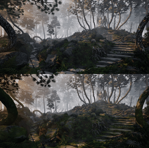
As you can see, the moss made a HUGE impact on the perception of the place. It not only gave the environment much more of an ancient feel but also helped to warm everything up, accentuating those orange morning rays.
Lighting
Lighting is an area I don’t have too much expertise in and I’m learning more about it with each project. When I’m feeling overwhelmed by the technical side of the job, I double down on understanding what I’m trying to achieve. This way, I can still communicate the idea across, even if it isn’t technical perfection.
The key challenge was understanding how light works. After reading Colour & Light by James Gurney, I understood that with sunrises, shadows are softer, bluer and the reduced brightness of the sun takes on a golden color.
The lighting setup is simple. The sun (directional light) does the heavy lifting and I worked around it with foliage placement to light up the stairs and angel as naturally as possible. Tall trees are placed off-piste to cast patchy shadows over the foreground keeping the feeling of the looming forest consistent.
I lit the densely populated scene using Distance Field Ambient Occlusion (DFAO) to cast dynamic shadows on my foliage and meshes without the need to bake all those trees. This affects performance but for my purposes, not the end of the world. I was able to achieve soft shadows and just the right level of indirect lighting with the SkyLight intensity slider.
After finishing the project, I learned that using a stationary directional light would have been better as it supports dynamic shadowing through Cascaded Shadow Maps. In essence, providing the dynamic shadows I’d need with the animated foliage but fading into baked shadows at a distance. It’s always too late when you find out!
I experimented with different HDRI’s in the Sky Sphere cubemap to get the shadows looking blue. Ironically many of the sunrise maps I tried emitted strong greens or oranges depending on what was in the foreground of the photo.
I ended up using a generic overcast forest HDRI in combination with the ‘colors determined by sun’ checked on in the Sky Light and temperature adjustments in the directional light. HDRIhaven.com is your best friend.

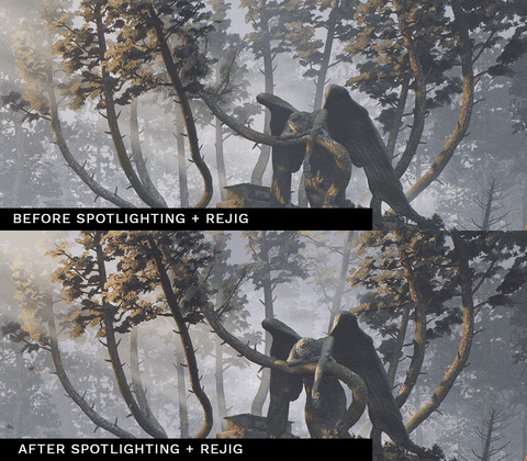
There are a handful of spotlights by the angel to make sure her dramatic, saddened form is exaggerated. This is achieved by rim lighting her head, wing and drooping forearm from the direction of the sunlight. Changes were also made to support this such as the angle of the statue, the amount of vertex painted moss and the thickness of the leaves.
Color Grading and Post-Processing
Finally, the color grade made a huge impact on the mood of the environment. Briefly, here’s how I dealt with post-processing, grading and Look-Up Tables (LUTs).
I took a 4K screenshot of my main camera view and brought it into Adobe Lightroom. (I prefer to color grade there but Photoshop and the post-processing effects in UE4 are just fine). I used a really simple and free 3D LUT generator so that I could create .HALD and .CUBE files. An .HALD file is a 3D LUT converted into a 2D image. It’s a grid pattern that represents all the colors values and the program spits out a neutral, ungraded grid.
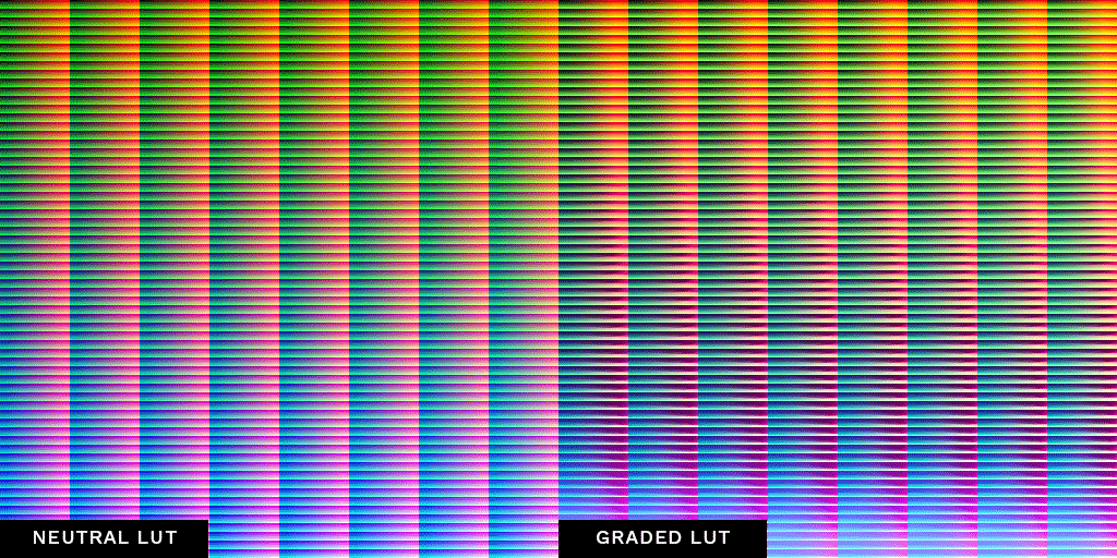
I took the neutral grid into Lightroom and pasted over my color grade settings from my Unreal screenshot. After that, I exported it as a .jpg, then used the program to convert my graded grid into a .CUBE map. From there I was able to drag and drop the LUT into both Unreal post-processing as well as Adobe Premiere Pro for my video. Basic settings of the color grade are shown below:
The color grade brought to life the time of day, keeping the shadows cool and emphasizing the deep, mysterious sense of the forest. It’s got a cold feel creating a somber tone but also has warm light that bursts into the scene. It’s the juxtaposition of sadness and hope that I visualized from the very start of the project and thoroughly rewarding to see it come to life.

It should be mentioned that the final grade looks extreme but the raw colors and light were already there in the scene.
Learning
Don’t Look for Inspiration
For me, it comes completely naturally, out of the blue. I regularly step away from the work to watch a movie or read a book or check twitter. I’ll allow myself to chill out and come back the project with fresh ideas. It’s important for mental health but also for replenishing creative energy.
‘Those Who Mourn’ taught me how to persist through some horrible creative days to achieve a piece of art I couldn’t have imagined making only 3 months ago. I really didn’t think I’d finish it, or at least, not to the extent that I managed to polish it.
It taught me to run while I feel in the zone and to take care when things are going more slowly.
Take What You Need
ZBrush, Marvelous and SpeedTree are exceptional tools for the things they are designed to deal with. Ultimately though, I picked up three new pieces of software and shook them until the things I needed from them fell out. I now have a richer technical skill set but I don’t ever plan to know what all the buttons do.
The Power of Fundamentals
This project represents huge strides in my understanding of art in general and how powerful the fundamentals are if you explore them. The fun of this environment came from discovering the principles halfway through and then applying them. Which shapes give off which mood? Why is highlighting the focal point important? Can I be bothered with the rule of thirds yet again?
Wearing a Designer’s Hat
It helps to think like a designer to make sure decisions synergize with the gameplay and the narrative. There might not be gameplay or a narrative with personal projects, but it helps to pretend there is because in the industry there’s a commercial product at the end.
Get Feedback and Play
I got tonnes of feedback but particularly from John Griffiths (Griffitii on Twitch). A quick paintover of your shot can change everything. Pay attention to the feedback that hurts the most. These are the wild suggestions that you weren’t even close to thinking of. Your gut reaction starts cursing at the idea of change but I’ve found that feedback like this hits the truth. Be open and vulnerable to constructive critique. Give these things a go. Some of the best decisions I made were as a result of just aimlessly messing about. Scaling stuff weird, throwing textures where they shouldn’t, jumping about the place with the UE4 man. Play and have fun. At the end of the day, we’re making games.
Share.
I’ve been constantly astounded by how much quality, open-source education there is being shared within the community. Everyone knows everyone and everyone shares everything. It’s incredible and it shocked me coming out of university. If you come across something really informative or useful, pay it forward.
Resources and Links
This is my promised list of resources. I can’t thank these people enough for their incredible tutorials and support within the community.
| Area | Resource | Author/Artist |
| Inspirations | @Archillect | N/A |
| Referencing | Planning Game Art Environments | Tim Simpson |
| Environment Design | Defining Environment Language for Video Games | Emelia Schatz |
| Art Fundamentals | Art Fundamentals: Values | Clint Cearley |
| Art Fundamentals | 10 Minutes to Better Painting YouTube series | Marco Bucci |
| Forests | Art Tips for Building Forests | Danny Weinbaum |
| ZBrush | Andrew Averkin’s Environment Brush Pack | Andrew Averkin |
| ZBrush | Guide to Creating Feather Alphas | Pablo Munoz Gomez |
| Lighting | Colour & Light book | James Gurney |
| Lighting | HDRIhaven.com | N/A |
| LUTs | LUT Generator | IWLTBAP |
| Community | The Dinusty Discord Community | Dinusty |
| Community | The Griffitii Discord Community | John Griffiths |
Finally, I’d like to say a huge thank you to Kirill Tokarev for giving me this opportunity. We can all agree that 80 LEVEL plays an enormous part in sharing useful resources for free and making the industry a better place to be in.
Thank you very much for reading. See you around?
- ArtStation
- Twitter: @atkaygee
- Instagram: @atkaygee
Kieran Goodson, Environment Artist
Interview conducted by Kirill Tokarev
Ultimate River Tool is a powerful and easy component for Unreal Engine 4 that allows you to make rivers with automatic flow-map UV warping, cascades, and interactions with physical objects.
All future updates are included and will be available for download as soon as they are released.
© Daria for 80lvl, 2019. |
Permalink |
No comment |
Add to
del.icio.us
Post tags: 3d art, environments, gamedev, indiedev, Lighting, SpeedTree, storytelling, UE4, ZBrush
Feed enhanced by Better Feed from Ozh
Source : https://80.lv/articles/001agt-004adk-3d-environment-design-symbols-breakdown/


