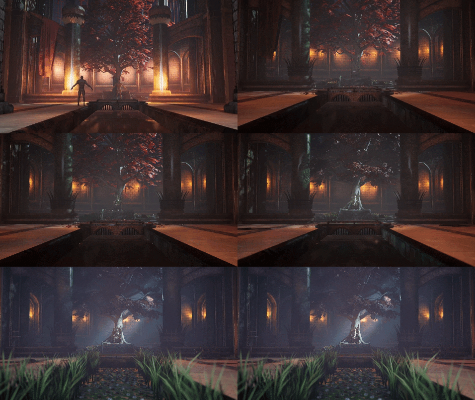
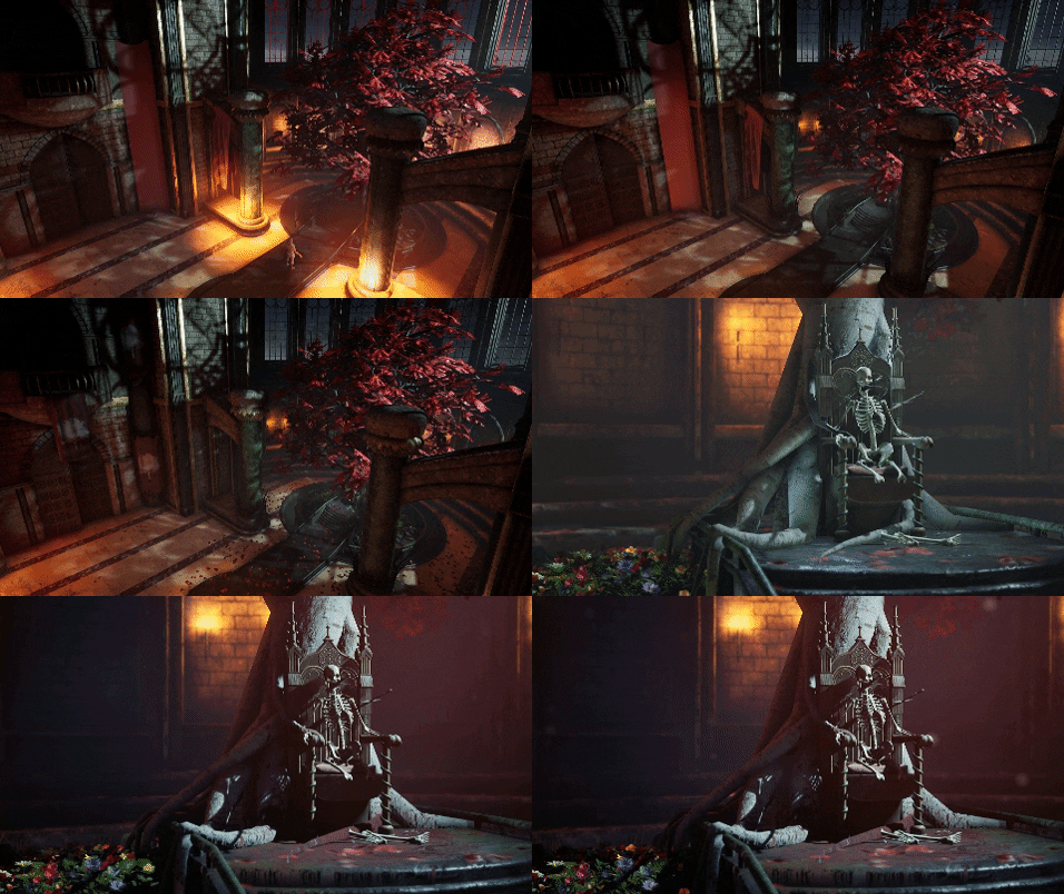
James Ward did a detailed breakdown of his UE4 environment Anadoned Throne Room inspired by English castles and Game of Thrones.
Introduction
My name is James Ward, and I’m a recent graduate from Staffordshire University in England. I graduated from the Game Art course and ended up falling in love with Environments near enough the very first day.
I’ve always loved games and their art, dating all the way back to 007 GoldenEye and Star Wars: Rogue Squadron on the Nintendo 64. Over the years, my taste in games has swayed back and forth from FPS shooters (Halo, primarily), racing games (Need For Speed, Forza, Gran Turismo, etc.) to Fantasy and Sci-Fi RPG’s (Knights of the Old Republic, Elder Scrolls, Mass Effect, Dragon Age, etc). Even when I was younger, I’d always be looking at how they made the games, squinting and leaning forward in my chair to see the TV a little clearer. At the time though, I never really followed that initial passion and curiosity (though now I certainly wish I had) and went off and did my thing for a few years after finishing school.
Fast forward a few years, and my initial career was leaving me miserable and I just wasn’t enjoying it. I figured I had nothing to lose, and I decided to take myself back to college to study something that I was interested in and passionate about. It was around this time that I found an advertisement pamphlet for Staffordshire University’s game’s courses (if I remember right, they offer the most diverse courses in the UK and it’s an absolutely huge department). I went through college for two years knowing that I wanted to study there. Long story short, I did and the connections I made there with equally passionate students is something that pushed me to be the best I possibly could and always try to go that step further with my work. If I wasn’t in a lecture, I was usually looking at 80.lv articles, posts on Ten Thousand Hours or Youtube tutorials and seeing how I could incorporate techniques from those into my own work.
Now, as I’m approaching my graduation day, I’ve participated in a number of Game Jams, made awesome strides in my own artistic ability (I don’t come from an art background at all) and I’m hungry to enter the Game Industry as an Environment Artist.
Abandoned Throne Room
Initial Design & References
Oh boy, this scene has been in the planning for about 3 years, give or take a few months? So I always wanted to do a Throne Room as my final year project for University. I wanted to create something grand that would stand out from the crowd. Now, as the years went by, ideas changed, scope went up and down and all sorts. That’s just how things go, and it was very natural and very fluid in those regards. In all that time, however, I hadn’t put pen to paper so to speak, so I had no real sense of how it was going to be structured, the composition, nothing.
So, when it came time to start planning our Final Year Projects (FYPs), immediately I was out taking hundreds of photos for all sorts of things over my Summer when I could. I’m very lucky to live in the East Midlands of England, as there are dozens of Castle Ruins maintained by the National Trust that date back hundreds of years within easy driving distance. I also took a trip down to Cornwall’s Eden Project and took a few hundred photographs of various foliage from the few different biomes it supports (English/European, Mediterranian, and Rainforest). I can’t stress enough how great it is to go out and grab photo reference of real-world versions of what you plan on making. Not only for better images, but you can really get a sense of how it feels to touch it, how the light reacted at different angles, erosion, etc.
I have hundreds of reference images of real-world structures and plants, but I’ll post a few below that really helped me start coming up with some plans and the initial blockout:
Exeter Cathedral was a big one for inspiration, particularly as a lover of medieval-era history. The sense of scale and just how grand and imposing it was, was absolutely insane. The architecture was something that immediately just took my breath away, especially how it had been designed to lead the eye directly to the front with its leading lines. It was around this point that I started picking up on the similarities between Cathedral, such as Exeter, and Throne Rooms.
There’s a whole psychology behind their design that targets the subconscious that is really interesting. For example, Thrones are always raised up from the floor (particularly in the older medieval era Throne Rooms) because it forced the individual to look up and see that the owner of that throne was higher than them, more imposing, more powerful, etc. This was something I knew I had to include if I was going to try and attempt to make it work.
Ah, the Red Keep from Game of Thrones. I’m an avid Fantasy and Sci-Fi fan and immediately fell in love with Game of Thrones in all its media formats. If you want out of this world castles and keeps, look no further than George R. R. Martin! I particularly recommend ‘The World of Ice & Fire’ book as it includes so many wonderful illustrations of that world that it makes for wonderful inspiration.
I remember looking at the Iron Throne, as depicted in ASOIAF (above image) and wondering what it would be like to replace that with a tree, or something organic along those lines. It was around this time that I learned about the Gardener Kings from the very same book, who had a throne carved from a Weirwood tree.
I’ve never been great at concepting (though I’d love to get into the 2D aspect of things more), so I approached a friend of mine at the university who’s on the Concept course (here’s his ArtStation). I mentioned what I was looking to make, the scope and scale and sent him a few images to help him get an idea. An hour or so later, and he’d given me my first real representation of what I’d be making.
Blockout
The blockout was actually the easiest stage, I would say. I initially created a quick blockout in Maya with the UE4 Mannequin as a scale reference to try and work out how I was going to break it up. One of the first things I spotted was how the room is essentially symmetrical with various little props breaking it up.
I was initially going to smash up the scene a lot more and have large trebuchet boulders having impacted some of the models and blown through walls etc. Eventually, I decided against it, admittedly more so I could get some re-usability out of models further down the line, and also because I thought it drew the eye from the tree a little too much.
Once the blockout was in-engine, I started looking for camera angles for composition. These actually changed very little throughout the process. The composition would make or break the scene, so I went all-out on doing everything for a reason. As a result, I wanted to get a nice blend of soft and hard shapes that complimented each other and the color palette that I was experimenting with. The tree was just a really rough model created in SpeedTree that I threw together in a few minutes, just so I could get it placed and work with it in-engine.
Initially, I was really taken with the idea of very pale stone for most aspects of the scene, offset by a dark floor. A lot of my reference gathering had shown me very bleached stonework in a lot of ruins, though it later occurred to me that it was mostly due to a lot of the ruins not having any roofing left to speak of.
Approaching the materials for the scene really early on was going to be super important too. It would determine my entire workflow. I’d already decided I wanted to take nearly every model through ZBrush to push my knowledge and experience in that program, so how would I build the Master Material to incorporate that?
Well, I decided to tackle each model with multiple UV channels.
- UV Channel 0: Unique Unwrap
- UV Channel 1: Lightmap
- UV Channel 2: Tiling Unwrap
I decided that I would generate masks in Painter based on the High Poly (Damage, Dirt, etc.) and blend a number of Tiling Materials to essentially create the appearance of a uniquely texted asset. Nearly everything in the scene works off of this, with the exception of three assets (even the Throne follows this Material). The downside, of course, is that there’s a lot of Material Instances in the project and you can’t bake something that would have another material applied to it. It’s a lot of give-and-take.
A really early example of this material can be seen below:
Nearly every aspect of the Master Material was made into a parameter, so as to maximize the adaptability and reusability. I was ready to really start cracking on with the art side of the project.
Building the Scene
The architecture was the biggest challenge. Already at this point, there were aspects of the blockout that either weren’t working how I was hoping they would or just weren’t working with the composition I was looking to go with.
Many of my references actually helped me come up with some interesting alternatives for some of the aspects of the scene. When building any sort of building, having at the very least a vague idea of how architecture works is really important. How would this wall support this ceiling? How strong is that balcony if it juts out x-amount from the wall? Will it collapse under its own weight? Again, references were really important in this aspect because you can see trends across different visual styles.
I kept my models as modular as possible. I knew I was creating a fairly contained scene, but I didn’t want to have to make fifteen different types of a pillar. I generally tackled one asset at a time and just slowly chipped away at them.
I constantly played with lighting and messing about with detailing on the assets. What worked, what didn’t? What helped the composition and the organic feel, what looked too basic? I found myself constantly blocking the large architectural assets out and replacing them.
I distinctly remember looking at the large open floor and thinking how painfully boring it looked. There was just absolutely no visual interest in it at all, so I went back to the drawing board. I started looking into the psychology of the piece again and thought about some more leading lines pointing at the Throne and the tree.
This went hand-in-hand with another issue I was having throughout the project up until this point as well. How had the tree grown so large? How was it not dead, or at the very least a lot smaller? How was it getting its nutrients? I ended up making a trough/small canal that cut through the center of the floor to address this and pretty much just fell in love with the idea. Again, the psychology backed it up as a design choice as well, in the sense that no matter which side of the room you were on if you wanted to cross, you had to step in front of this throne that had been swallowed by this huge tree.
It did raise the issue of how I was going to break the floor up to fit around it. It was such a unique shape that I essentially had to split the floor down the center and cut the shape of the throne section out of it. I ended up doing a quick Boolean and just tidying up the remaining geometry.
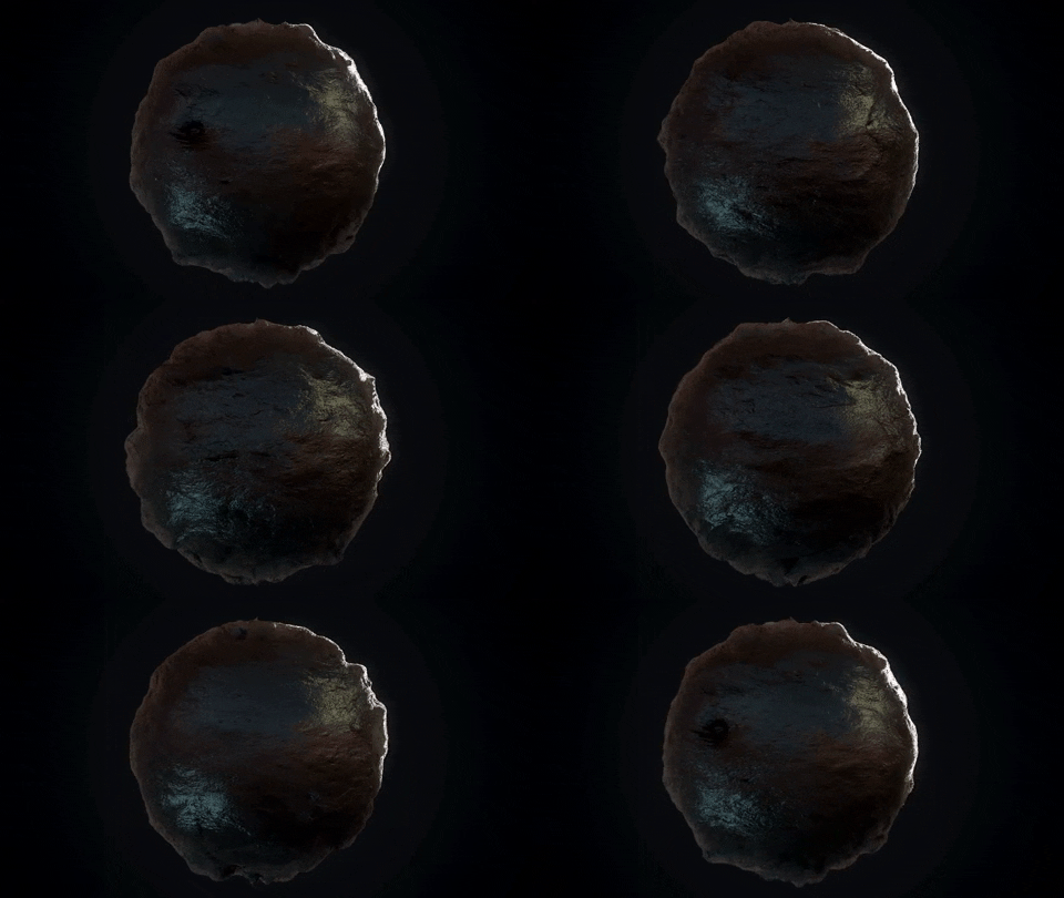
I didn’t want it to blend in with the rest of the color palette though (which ended up being very organic greens, browns, and reds). I wanted it to pop and stand out from the floor. It was around this time I stumbled on a photo from Game of Thrones of a part of the castle at Dragonstone. I’d provide the photo but unfortunately, I never had the forethought to save the image and it appears to have been swallowed by the internet. What caught my attention though, was the use of Obsidian in the construction of the area around the Throne and how it caught the light – it looked incredibly oily and slick and I thought it looked amazing. I immediately set off on building it in Designer (which I’ll get into later). It took a few iterations to control just how noisy and damaged it was, but I think the final result worked pretty well.
The image below was one of the earlier attempts. I got some really useful feedback from Dan McCabe at Codemasters at just how uneven it was. I always find it really useful to just get a second pair of eyes on something and I can’t emphasize just how much I value the feedback of everyone that took the time to offer their two cents. Just a few names off the top of my head, Tim Simpson, Dan McCabe, Daniel Fern, Lewis Thompson, a dozen or more fellow students, lecturers – the list goes on and on.
Trimsheet
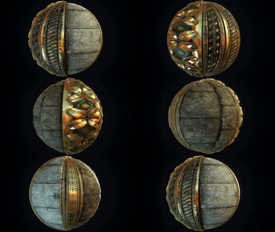
Pretty early on, I had the foresight to create a Trimsheet with some interesting repeating patterns. Inevitably, some patterns got used more than others just because they worked better or they were more readable.
I approached the Trimsheet the same way I approached my models. I wanted there to be damage and dirt and a number of other imperfections on the detailing that I wouldn’t get if I went with only using a Normal map.
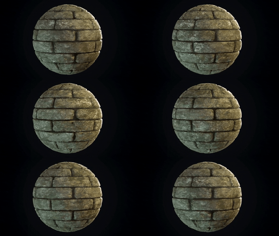
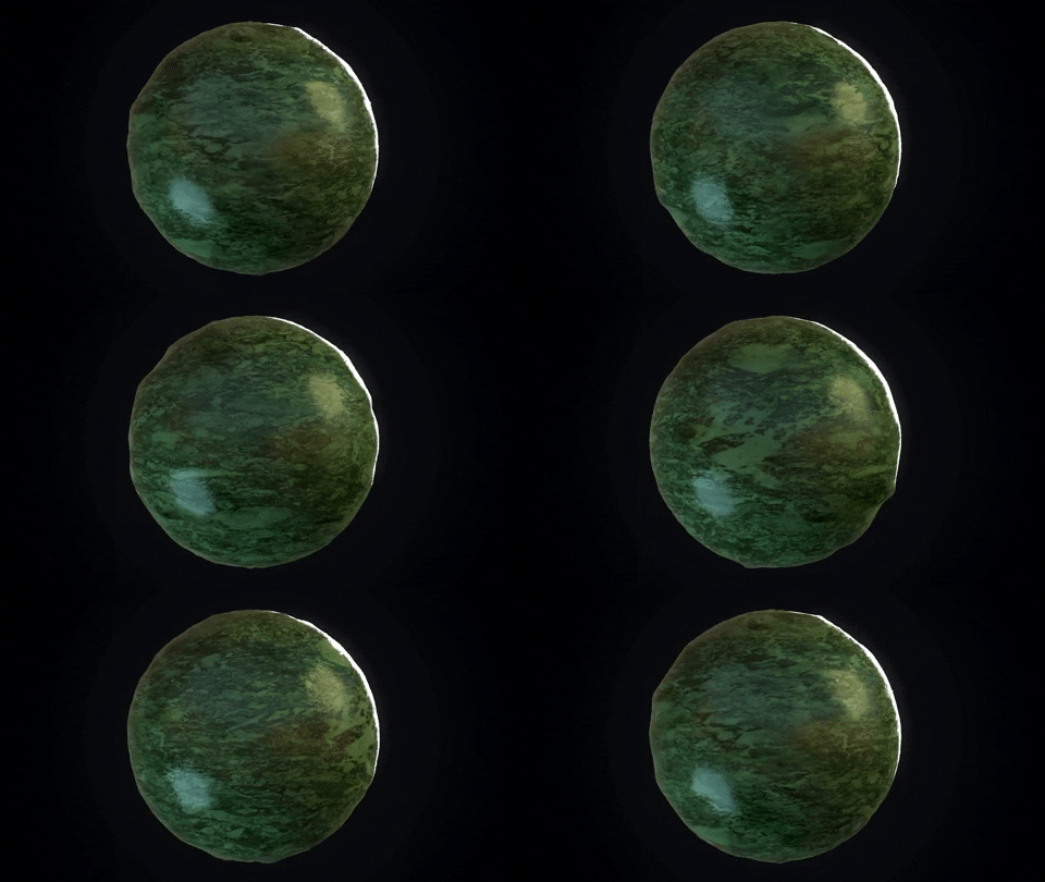
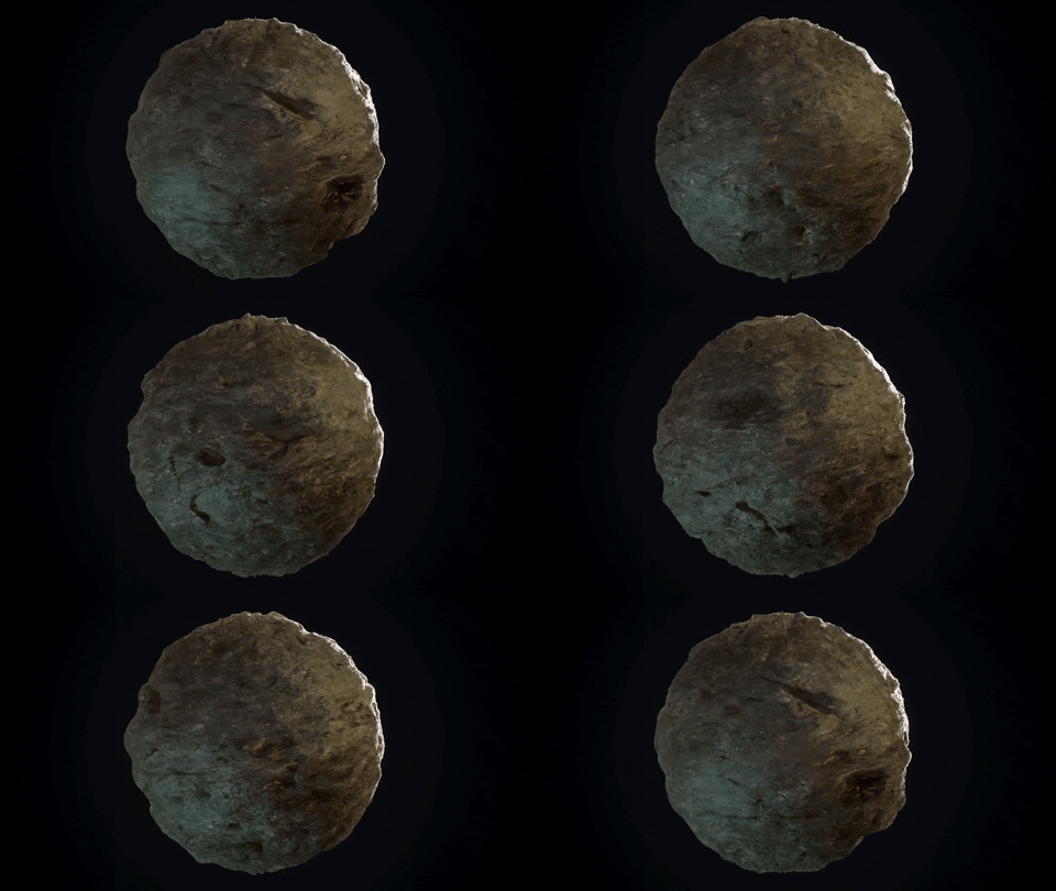
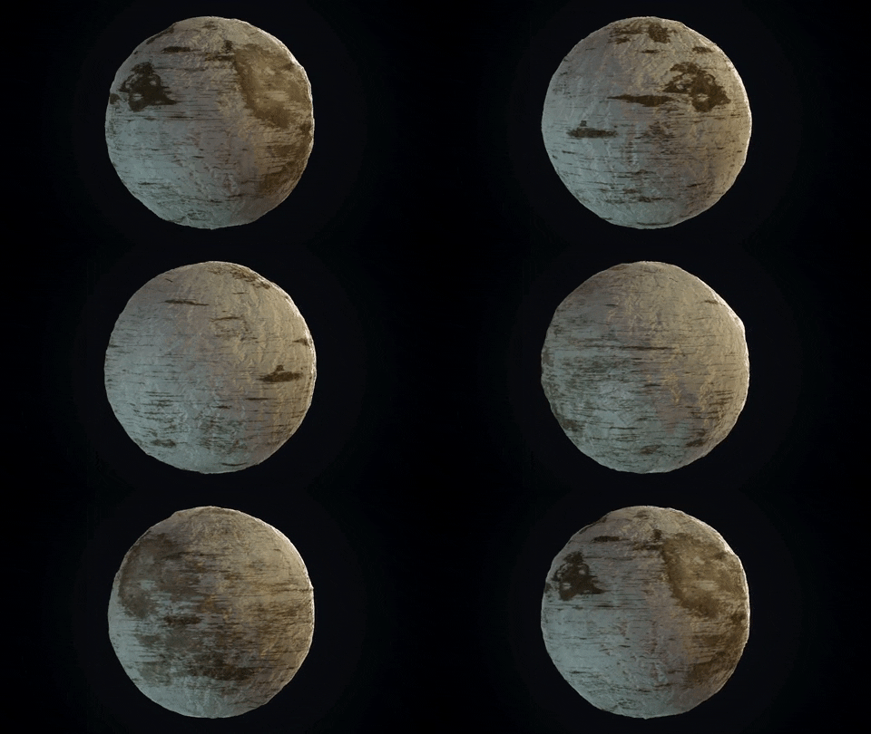
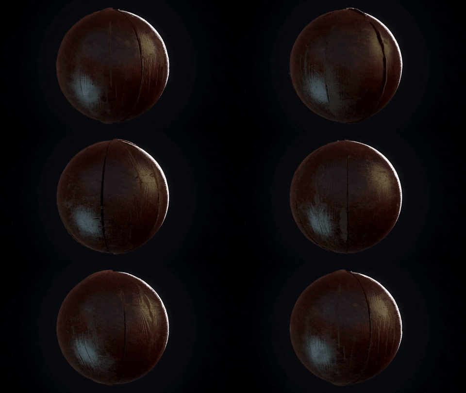
As a result, I used a number of materials that I’d created fairly quickly in Designer to texture it all. Some of those materials were different types of stone, Gold, Jade and some Black Steel. I’ll post the GIFs of some of my materials below (the also can be checked closer here).
Wooden Panels:
Texturing
So, over the last few years, Designer has really taken off. I’m blown away every time I open ArtStation by what people are making in there. For myself, personally, I always struggle to initially get started, though it’ll just take practice. To overcome this for this piece, I thought I’d play to my strengths, so I essentially created a hybrid workflow between Megascans Photogrammetry and my own ability in Designer. Megascans is such an amazing resource, not just for texturing, but for all sorts of references – particularly if you’re going to be tackling foliage.
Essentially, I used the materials from Megascans (primarily the height information) and then layered my own edits and tweaks on top of that to create something that would suit my needs, so by the end of the process, the material was essentially completely my own and unrecognisable from what I started with. At least, that was my goal – some materials are easier to change than others. For example, wooden planks will always be wooden planks, etc.
Though, because I used Megascans as an initial base for some of the materials, doesn’t mean I relied on them completely. For some materials, such as my brick work, I created a tiling material through ZBrush and baked it down. There are a thousand ways to get to whatever goal you’re aiming for in 3D but don’t rely on one indefinitely. Be as flexible and adaptable as possible to achieve your results.
Central Pieces: Throne, Tree
The Throne was something I went back and forth on quite a lot. The chair itself was fairly simple to make with a number of various references from different media. I knew pretty early on that I was going to be wrapping the roots around the chair, so I had to be careful about details.
As with all of my models, I created a quick base-mesh of each part for general position and scale and then took it all into ZBrush to generate the High-Poly. For some parts, I would just do a simple Crease, Sub-Divide, Polish method to get nice soft edges where I needed them, and others I’d Crease, Sub-Divide and then smash out the edges with the TrimSmoothBorder brush. I found a Square Alpha and a Focal Distance of -100 works wonders for nearly every material I’ve had to sculpt. All-in-all, the High-Poly took about twenty-thirty minutes to build. The game-ready asset was simply just a cleaned up and UV’d version of the base.
The tree was hands-down the hardest part of the entire project. I really enjoy doing foliage – it’s something I’m always looking to improve, but it’s just as equally frustrating as it is rewarding at times.
I must have made four or five different atlases for the tree, and while each was better than the last, it still didn’t look quite right. The final version involved me sculpting two or three leaves and then hand-placing them in ZBrush along the branches – it task that took a day or two, but ultimately it paid off in the long run. The textures were done in Designer and it was a fairly simple task of creating the planes (and by extension the clumps) in Maya before exporting them to SpeedTree.
The roots were pretty fun to do, actually. The actual model for the roots is actually entirely separate from the tree and just ‘crashed’ through the model in UE4. I used simple Splines in Maya to create the shapes and generated cylinders that conformed to said Splines. With them made, it was a simple task to taper them and then they were ready for the engine.
The skeleton was actually provided by the awesome Storm Flemming over on ArtStation. She was kind enough to let me use it for my scene.
Lighting
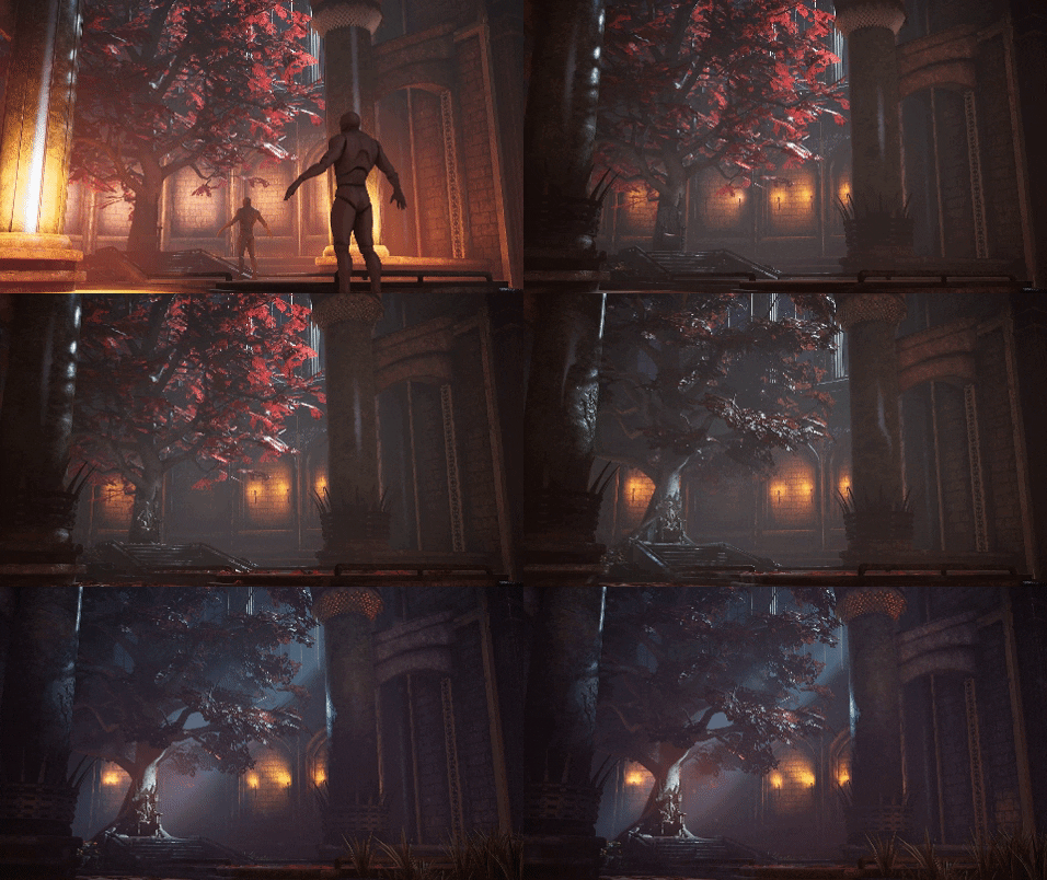
So as I mentioned, the lighting was worked on constantly throughout the project. Initially, I was going to have the time-of-day to be roughly noon, early afternoon. I found it pretty difficult to get my histogram balanced across the scene though. Lots of dark areas that I couldn’t find a reason for there to be a secondary light-source to help it.
After throwing the idea around for a few days, I did a really quick test of it as a moody midnight setup and thought it looked so much better. I wanted to create a real cinematic feel for it and the nighttime lighting worked perfectly for it.
I constantly lived in the Histogram window in Photoshop as I tried to balance my values. With dark and moody scenes, a lot of the great pieces on ArtStation tend to have a nice gradual curve up into the left-most values and stopping just before it hits total black.
The entire scene is fully baked, with the exception of a single Dynamic light that is highlighting the throne. This was a conscious decision as the baked lighting ended up being a little too soft for what I wanted. I played with the idea of using a Light Function Material to give the impression of some leaf silhouettes on the bark but eventually decided against it after some initial tests as a lot of the light on the trunk got masked out.
In terms of color, the good old cyan and orange always work. The cool moonlight coming through the windows compliments the warm orange torches perfectly. There’s no need to reinvent the wheel if you’re attempting to do your lighting. If it works, it works. I stuck with using color temperatures and low-intensities for the most part, more often than not looking in the Unreal Engine tutorial levels and seeing how they approached a lot of their lighting. So much can be learned from picking those scenes apart – I can’t recommend them enough to anyone wanting to get into Environments.
Final Words & Plans for the Future
It was an absolute pleasure breaking this scene down for 80.lv and anyone interested in how I went about the scene! Any critique or feedback is more than welcome and I can’t wait to hear everyone’s thoughts on it!
As for the future, I’m currently looking to break into the industry as an Environment Artist and surround myself with other artists that inspire and push me to constantly evolve and improve.
I have my next project for my portfolio already lined up, so I can’t wait to get stuck into that and show you guys when it’s all done!
James Ward, Environment Artist
Interview conducted by Kirill Tokarev
The goal of the ClearCut courses is to teach you a solid workflow that is used in the AAA game industry. The second episode covers the process of creating 4 very different materials from scratch in Substance Designer.
Any future updates are included and will be available for download in case they are released. Next episodes are not included.
© Daria Loginova for 80lvl, 2019. |
Permalink |
No comment |
Add to
del.icio.us
Post tags: 3d, 3d art, blockout, environment, environment art, Substance Designer, texturing, throne, trimsheet, UE4
Feed enhanced by Better Feed from Ozh

Source : https://80.lv/articles/001agt-throne-room-in-ue4-blockout-hero-props-texturing/


