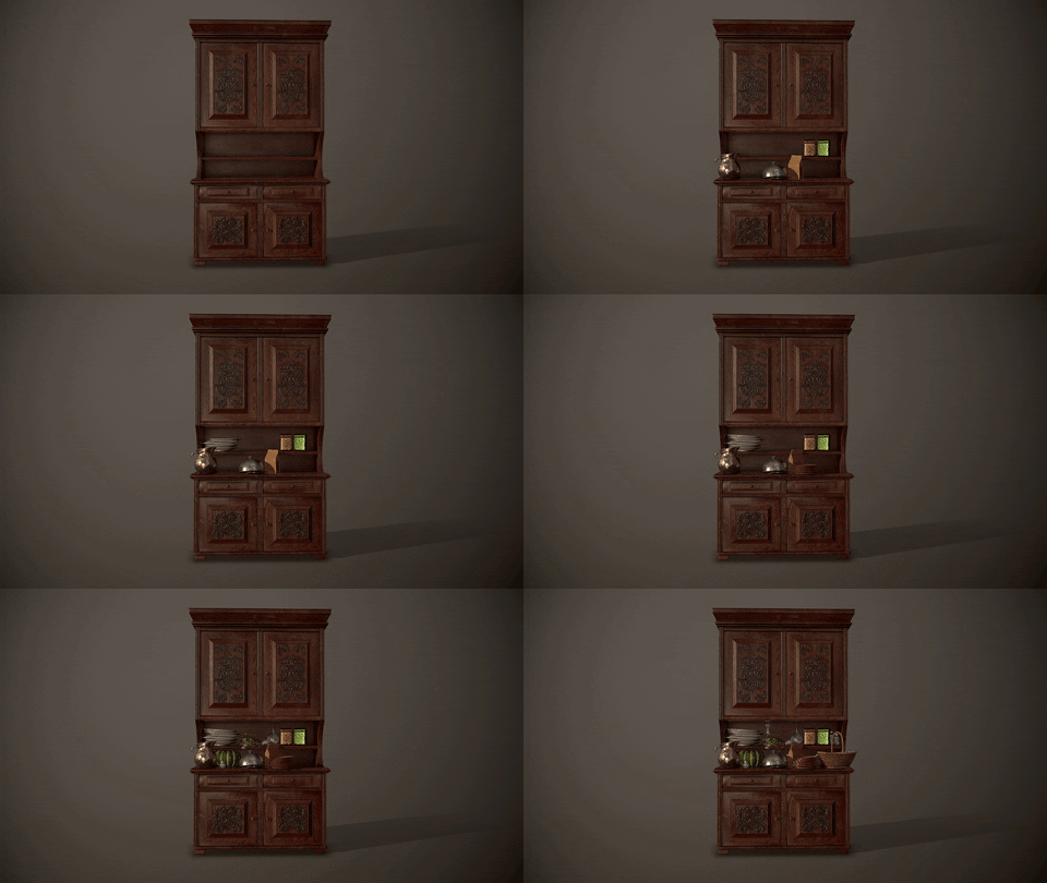
Nick Comeau did a breakdown of his Howl’s Moving Castle Living Room environment and shared a handful of useful tips on creating wood, glass and tile materials with Substance tools and lighting in Marmoset Toolbag.
Introduction
I’d like to start by thanking everyone at 80 Level for this opportunity! My name is Nick Comeau, and I’m currently an Environment Artist at Raven Software working on Call of Duty. I started at Raven a little over 3 years ago, and have worked on CoD: Modern Warfare Remastered, CoD: WWII and CoD: Black Ops 4 during my time so far. Before coming to Raven, I went to Champlain College in Burlington, VT, and studied Game Art and Animation.
Originally, I was interested in working on animated films. Before college, I hadn’t done digital art of any form. During my time there, my passion for making games grew, so when I had the opportunity to join the team at Raven, on one of my favorite games, I jumped at it.
Howl’s Moving Castle Living Room
This project actually started back in college, years ago. My original plan for this environment was to do a much larger part of the house from Howl’s Moving Castle. I had started blocking it out in Maya and getting large shapes but got overwhelmed as I started to get into how many small assets and so I never finished it. When I recently was looking for a new project to work on at home, my wife reminded me that I had this project sitting on the shelf still, so it felt like the perfect thing to start on. My goal starting on this was to scope down to doing just this corner of the room, to make sure I came out with a finished piece, and hopefully not ruin the beautiful art of Studio Ghibli. I wasn’t sure if it was going to turn into something more realistic or if I would lean more into the Ghibli art style.
Starting the Environment
As to not get in over-my-head again, I broke this environment into several parts: the dish rack on the left, the cabinet on the right, miscellaneous models, and tileable world materials. While this breakdown won’t work for every or even most projects with so many small props to make, giving myself these benchmark goals helped me pace my way through and kept me motivated.
Having the movie to sift through for reference for this room was a bit of a double-edged sword because there are several different states this room is shown in. It ranged from being extremely dirty to having different architecture altogether. Something I noticed though while looking at the reference I gathered is that there was always a large number of unique assets everywhere. I felt like that was what brought character and charm to the space, so it was something I wanted to make sure I kept in my environment.
With this project, I went a bit backward from how I would normally approach something at work. Usually, I would build the walls, floor, ceiling, etc. first, and then start to fill in props from there. For this project though, I was most excited to work on all of the props. Making the two large pieces (the dish rack and the cabinet) first allowed to get the accurate scale for the smaller models and the room as a whole afterward.
Texturing Tips
The first thing I think about when texturing an asset is how it would be used in the environment. Most props in this scene would be washed and handled after use i.e. have lots fingerprints and smudges. Substance Painter makes it absurdly easy to do this. After getting the base material(s) for an asset setup, I apply a handful of fill layers with masks. In most cases, I turn on just the color and roughness layers (I was working in Metal/Rough for this project). Then, I apply a black mask and add a fill to the mask. The fill is where you add what effect you want to start with. Here, I add one of the base Substance fingerprints. Most of the time I’ll then turn this to tri-planar to project it across the mesh as opposed to the default of projecting it across the UV space.
Then, I add a paint layer on top of that fill in the mask and start painting out where I don’t want it to show up. I usually like to use brushes with a bit of irregularity like the Artistic Heavy Sponge, because I think it tends to look more natural than trying to just use a standard hard or soft brush. Once you have it where you like it, you can now adjust the color and roughness to get the desired effect. Try out different blending modes for the color, you might find a happy accident somewhere in there. This worked great for all different types of effects used on almost every prop.
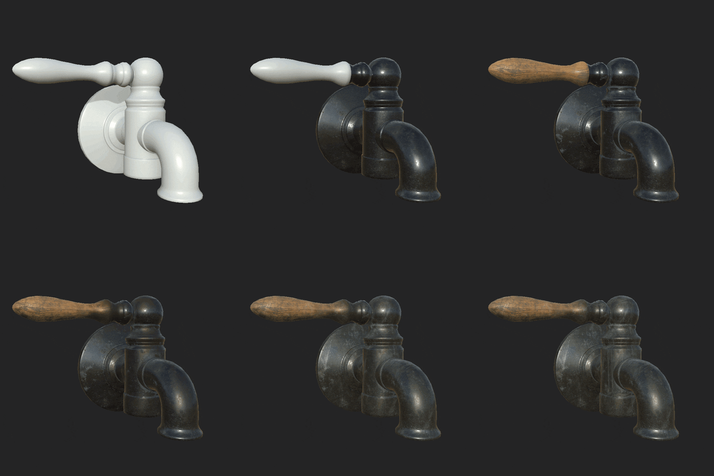
In the case where I want a very specific mark, I started off with the fill again, adding a black mask to it. I add a paint layer on the mask and inside my brush settings, I then select what I would like to project in the stencil.
I normally will turn on tiling so I don’t get any hard lines when I’m painting it. You can paint this either on the model directly or on the material by changing your brush settings like normal. I like to work with fill layers most of the time because you can go back in and adjust the color/rough/etc. after the fact if needed. It’s a much less destructive way to work.
Tile Material
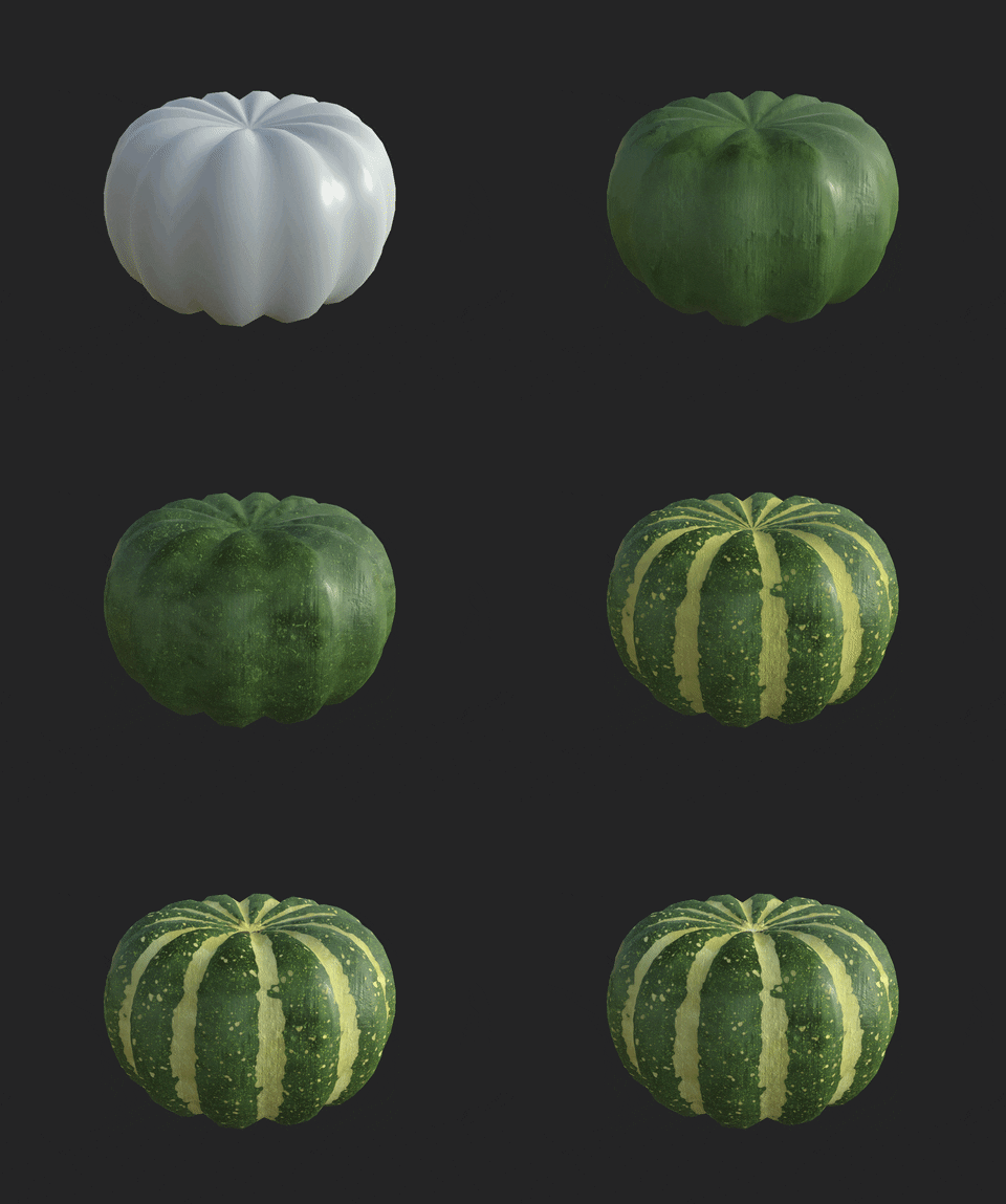
Tile is a great material to make with Substance Designer. The first thing to do when you approach a tile material like this is to set up your base pattern. No tiles are going to be perfectly placed, so adding slight rotation randoms, height randoms and slope randoms is a nice way to make it look more natural. I wanted to be careful to not go too overboard, especially with the rotation random, because the tiles will start to intersect with each other and I didn’t want that here.
My favorite way to get the random slopes and height variations is to use a flood fill on your black and white tile pattern, and blend those into your heightmap.
After I set up my tile and was happy with how the height map looked, I started making the pattern on the tiles. This is a relatively simple pattern. It mostly consisted of shape nodes, warps, transformation 2D, and mirroring, then blending them all together. Once I made the shape, I input it into the pattern of another tile sampler and subtracted some grunge on top of it to make it look less consistent and chipped off.

I used that to add to the color, blended a few grunges, some edge wear, and added a grout underneath. Then there’s your tile! I brought it into Marmoset to be able to see it in the lighting and made slight adjustments from there.
Something that will make your life easier when working on a material like this is to turn settings like the tile amount, rotation, size, etc. into input parameters. That way, if you decide later on that you actually want your tiles in a 5×5 grid instead of a 4×4 grid to get rid of some repetition you’re seeing, you just change the parameter amount and everything changes together instead of having to edit each tile sampler instance individually. Those will be easily accessible if you just double-click on a blank space in your graph editor.
Wood Materials
The shelf was the first asset I made for this project. First thing’s first, with assets made out of wood, make sure your wood grain is facing the right direction! If you don’t know how something is constructed, look up references. It’s something that is easy to forget but will make a huge difference if you don’t do it. Once that is set up, I wanted to add the colored dots along the front of the shelves. When baking the high poly, I used the Material ID based on Mesh ID to help me mask the dots exactly to then add a variety of different colors blended on top of the wood.
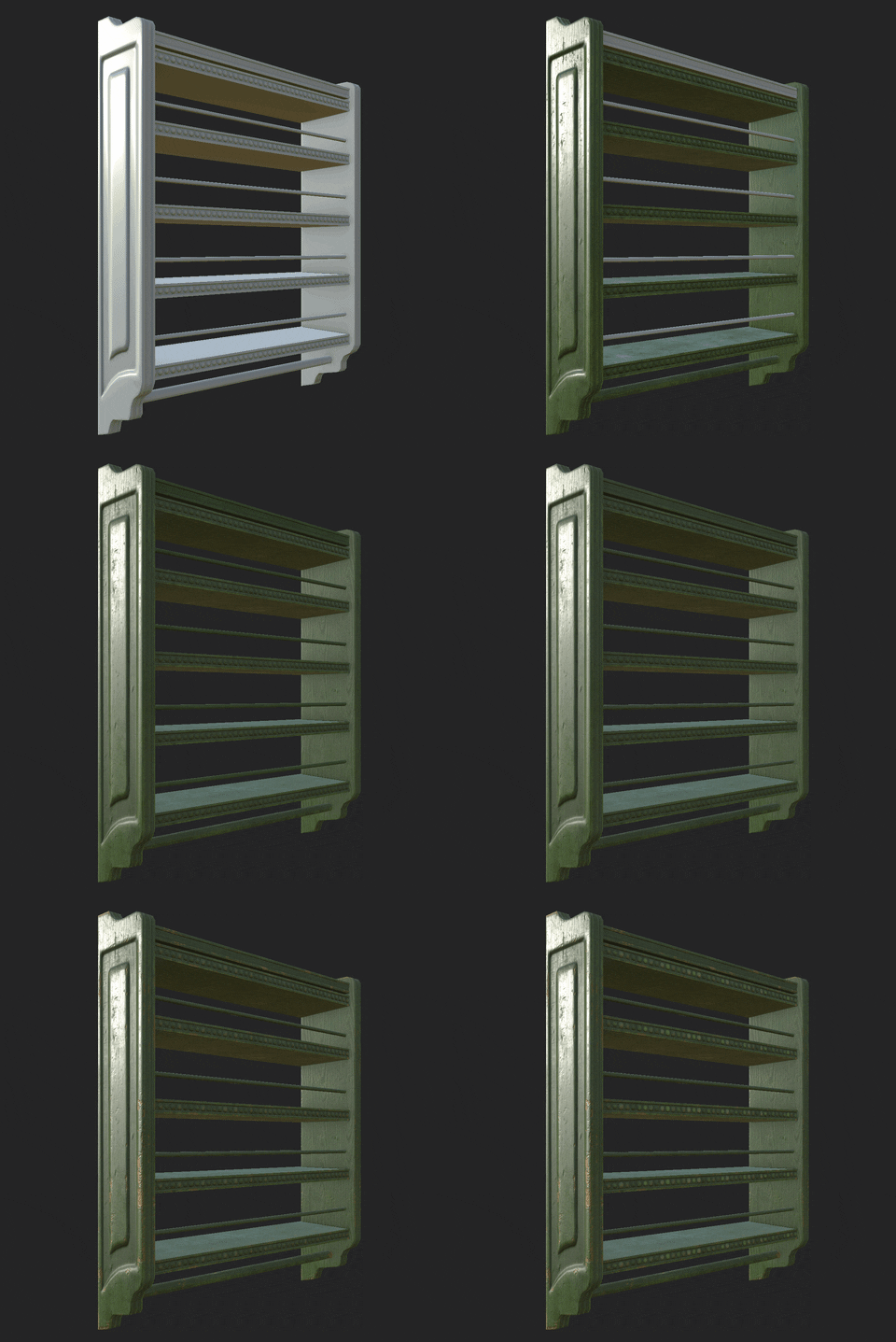
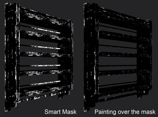
After the painted wood was set up, I added in a plain wood material with a smart mask for the spots where the paint is going to be chipped away. I made sure that the height for this layer was set slightly under the painted wood, that way it looked like there was slight depth to the paint. Once that was set up, I started trying different smart masks to get a good starting point, and then painting on top of them in the mask to get rid of areas where it made the material look repetitive.
For other models made of wood in the scene, specifically on the cabinet, one trick I used in Substance Painter was to add a darker varnish around some areas like the carving on the doors of the cabinet. I found it easier and more flexible instead of sculpting it on the high poly. To do this add it with masks in Substance Painter. I started off by making the stencil in Photoshop, importing it into Painter, and stamping it in place. I did this on a fill layer to affect the height. Once you have that layer, right-click on your mask and “Add anchor point” towards the bottom, then name your anchor point. It will show up in your mask stack. Make a new fill layer. I applied a smart mask to that layer, and inside the mask (in this case, the mg_dirt layer) you’ll need to turn on two things for this to start working. There’s a drop-down called Micro Detail. The original layer I had created was affecting the heightmap, so I turned “Micro Height” on. Then, farther down in your image inputs, click your Micro Height and add the anchor point you created.
The wood material I made specifically for the floor was created in Substance Designer. Some time ago, I had found a tutorial a long time ago that I followed to get the first iteration of the grain that I then added and adjusted. Sadly, I can’t remember where I found that tutorial. The basic idea here though is that you start with an Anisotropic Noise and use warps and directional warps to blend in different types of shapes, and then add in the knots with a splatter on top. Once you have the base grain set up, use your wood board pattern with a directional warp with high intensity (say, 300) to make sure the grain on one plank doesn’t match up with the ones next to it.
The walls were decided to be created in Substance Painter. I wanted to include specific stains that the reference image had. Normally, if I was doing this scene at work, I would use another material on top of a tiling plaster to create the desired effect, but I didn’t have a library of grunges and stains to draw from. I used two base plasters blended together to create a more varied wall texture to start with. Then I started adding fill layers with masks just like I had for other models in this project. I used a variety of different grunges tiled on to start with, and from there painted out the parts I didn’t want. If you can’t tell by now, I really like using this technique. I think it’s quite effective at adding a lot of interest to your materials quickly.
Glass Materials
Most of the work with the glass is spent adjusting the roughness map. Layering grunges and smudges will go a long way with this. Also, another thing I found out is making the glass material slightly metallic will help with your reflections as well.
The glass was a bit difficult to set up in Marmoset. For this type of glass (transparent bottles, cups, etc.), you’re going to want to set your transparency to dither. It will look like it’s not rendering properly in the viewer at first. Go to your capture settings, turn up the sampling to either x100 or x400 and then render your image. Your glass should look fine in the render. The other big setting to turn on for glass material is your secondary reflections. I used anisotropic for all of mine. Each glass setup is a bit different depending on how it’s going to be interacting with the light in your scene. I always started by adjusting the Secondary Gloss and Secondary Intensity. You can add a bit of color to these as well which I did in one or two cases. Once that looks alright, I adjusted the Anisotropy and Anisotropy Direction until it looked how I wanted it to.
The window glass was a last-minute addition to the scene actually. I was originally going to have an open window, with some kind of blurred trees outside. My wife had the idea of adding it to the scene, so thank you, Justine! With a lot of the same settings in Marmoset as for the other glass, it was just a matter of blending some Perlin and Gaussian noise to make the normal and height map in Substance Designer and applying that to a plane. After that was in, I just added another large plane with an image of a blurred forest behind it to get a hint of colors outside and it was good to go!
Lighting Tips
Part of my goal for this project was to test what Marmoset could dol. I was prepared to bring the scene into Unreal if I needed to, but I was really interested to see how far I could push Marmoset. Once I got all of the models and materials into the scene, I started on the lighting. Before placing any lights into the scene, I started with picking an environment reference that matched the general tone/color. After that, I started adding spotlights. There aren’t any directional or Omni lights in this scene. The main source of my light is coming from the general fill lights. The cluster of lights I have towards the middle of the scene is being used for specific highlights, pointed in a tight cone directly at models.
With each of the spotlights I placed, there were a few main settings I tweaked: Brightness, Distance, Width, Spot Angle, and Spot Sharpness. With each setting, here are some things I would think about: I almost always start off by turning the Spot Sharpness to 0. When you’re working with fill lights, you’ll usually want a wider Spot Angle, as opposed to when you’re adding a light to specifically highlight a model, you’ll usually have a tighter Spot Angle. Adjust the distance to make sure you’re hitting the objects/walls you’d like to hit without hitting things you don’t want to. Small changes to the brightness go a long way. Make sure to change the color of your lights. You don’t want to add very much color because a little goes a long way. The width is very important. If you’re getting hard shadows (if you have shadows turned on for that spotlight), increasing the width will help to fade out the hardness of the shadows created. Be careful with this though because increasing the width will also decrease the spec hit on a lot of your materials. Lastly, while it can be taxing on your computer to use this too much, toggle on/off Contact Refinement to see what it does for the light. It can help with small spec hits. If it isn’t doing much, turn it off or your computer may start to chug.
In the end, I had quite a few lights in the scene. It started to slow down the work, so one setting I changed was turning the viewport resolution for “1:2 (Half)” in the Render Settings. It won’t affect your renders, it’ll make your viewport look worse, but you’ll be able to move around much more easily. Once you have your lights set up, turn on “Enable GI and Secondary Bounces” and try adjusting the GI Brightness. It should look better but might be hard for your computer to handle these larger scenes for too long.
Feedback
I think my biggest challenge for this project was the lighting. It’s something that I don’t have as much experience with (we have amazing lighting artists at Raven). It was a struggle getting it started, and I made a few attempts at it before asking one of our lighters, Dan Naughton, for some help. He had a lot of great insight and tips for me that I think really brought this project together, so huge shoutout to Dan! The other big challenge for me was the baskets. I didn’t expect it but they proved to be more difficult than I anticipated.
I think the main takeaway from this project is, if something isn’t working, instead of sinking more time into it, search for a different way to approach it. There are a lot of great resources, tutorials, and 80 level interviews to look at that can teach you new ways to approach something you’re having trouble with. Take advantage of the wealth of information people put out online.
Nick Comeau, Environment Artist at Raven Software
Interview conducted by Kirill Tokarev
Smudges Pack by Emil Skriver is a set of high-quality 4K 16-bit textures. In 3D software, the textures are very powerful when used as material masks or as gloss, normal/bump or metallic variation. In that way, the textures will add definition to your materials that react in a realistic way.
Check the full description and other Surface Imperfection packs
© Daria Loginova for 80lvl, 2019. |
Permalink |
No comment |
Add to
del.icio.us
Post tags: 3d art, environments, gamedev, ghibli, glass material, Howl’s Moving Castle, indiedev, marmoset toolbag, materials, tile material, wood material
Feed enhanced by Better Feed from Ozh
Source : https://80.lv/articles/001agt-002mrs-howls-moving-castle-scene-materials-lighting/


